Custom frontend · Cairn
Plaza Pointe Dental Specialists
Distinctive Cairn Frontend
Extended the Cairn system into a highly customized specialist website with bold visual direction, reusable components, and responsive interaction patterns.
01 · Overview
Reuse the system without repeating the design.
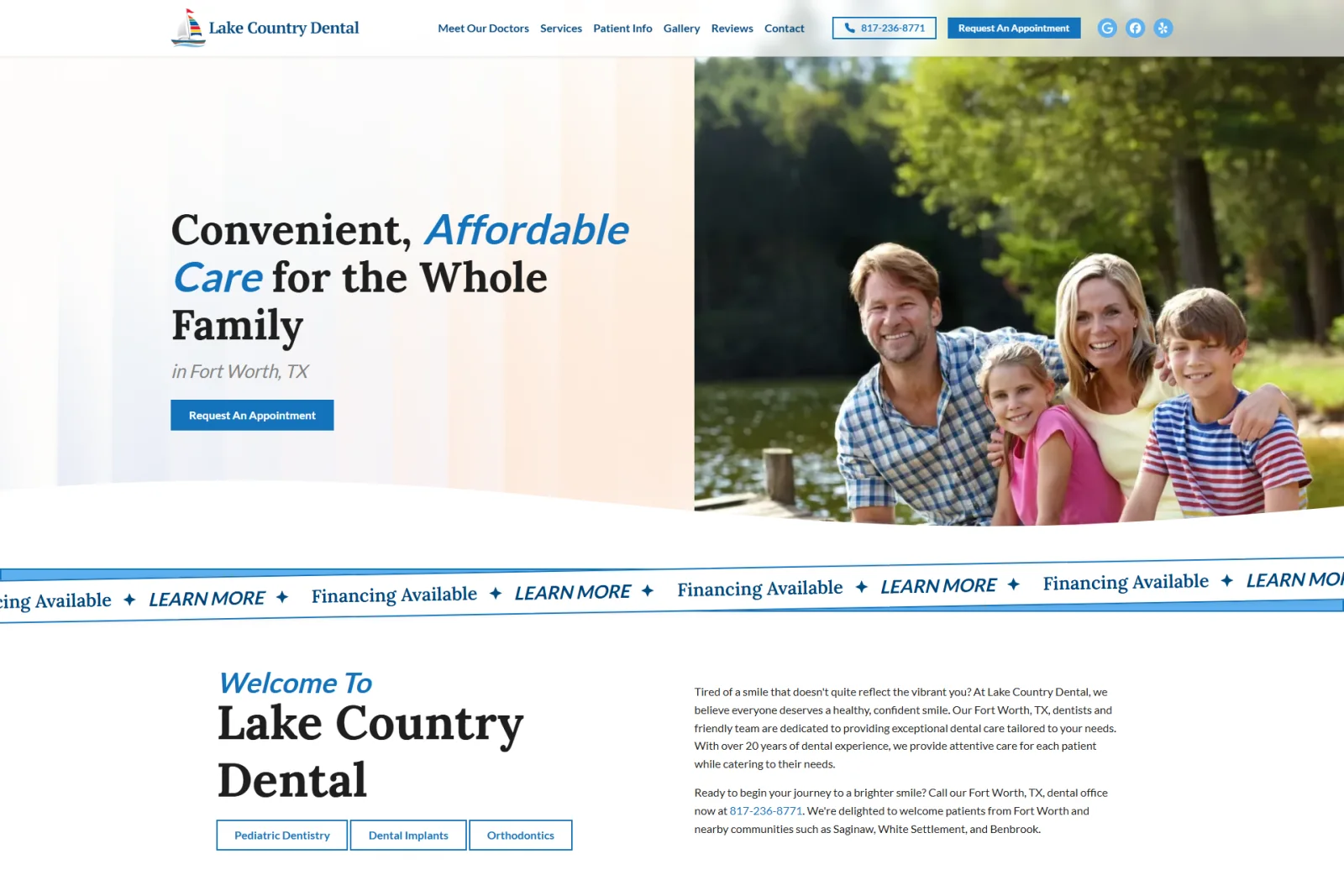
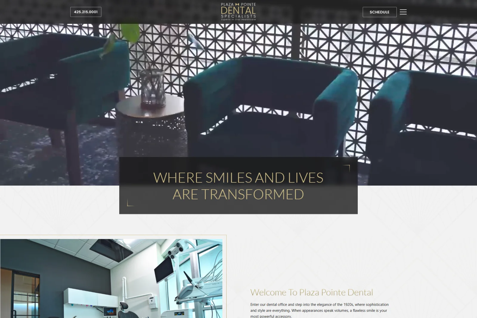
Plaza Pointe Dental Specialists was the second major client site built with Cairn. It reused the same structured frontend foundation as Lake Country Dental while translating a very different visual direction: dark surfaces, gold accents, video mastheads, layered backgrounds, editorial provider layouts, and more dramatic interaction patterns.
02 · The challenge
Push the system without breaking it.
The build needed to feel entirely distinct from the first Cairn site while continuing to use shared architectural principles. Complex visual compositions, specialist service hierarchies, multiple provider profiles, embedded forms, responsive navigation, and image-heavy layouts all had to fit within reusable component and data boundaries.
03 · What I built
Extend patterns where the design demanded it.
I directed the implementation of the header and navigation drawer, video-supported mastheads, provider card systems, doctor biographies, service-page structures, calls to action, Gravity Forms integration, review components, and responsive image treatments. Coding agents accelerated implementation and repository work while I handled visual direction, redlining, breakpoint decisions, QA, and final acceptance.
04 · Result
One foundation, a completely different outcome.
PPDS proved that Cairn could support a second client with a distinct brand and more ambitious visual demands without becoming a clone of the first build. Reusable systems remained intact while new patterns expanded the platform’s range and provided stronger evidence that the architecture could support varied client work.
Selected build evidence
One system, pushed in a new direction.
Responsive compositions, reusable interactions, structured configuration, and publishing surfaces from the finished client build.
01 · Responsive identity
Make the same brand feel deliberate at every size.
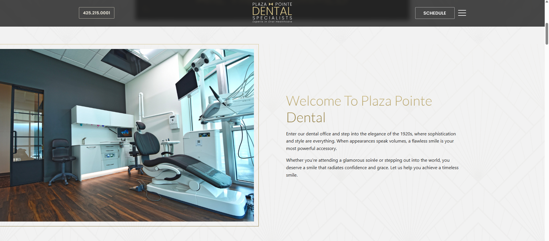
The desktop experience uses broad editorial compositions and layered imagery, while the mobile navigation condenses a large specialist site into a focused, touch-friendly route system.
02 · Provider system
Give each specialist presence inside a shared structure.
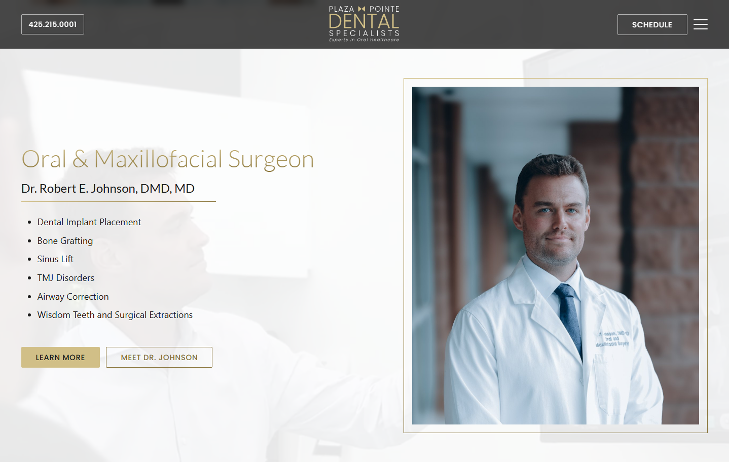
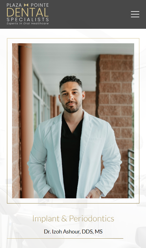
Provider compositions reuse consistent typography, image framing, service context, and calls to action while allowing each doctor’s content and photography to lead.
03 · Long-page navigation
Turn service depth into something readers can navigate.
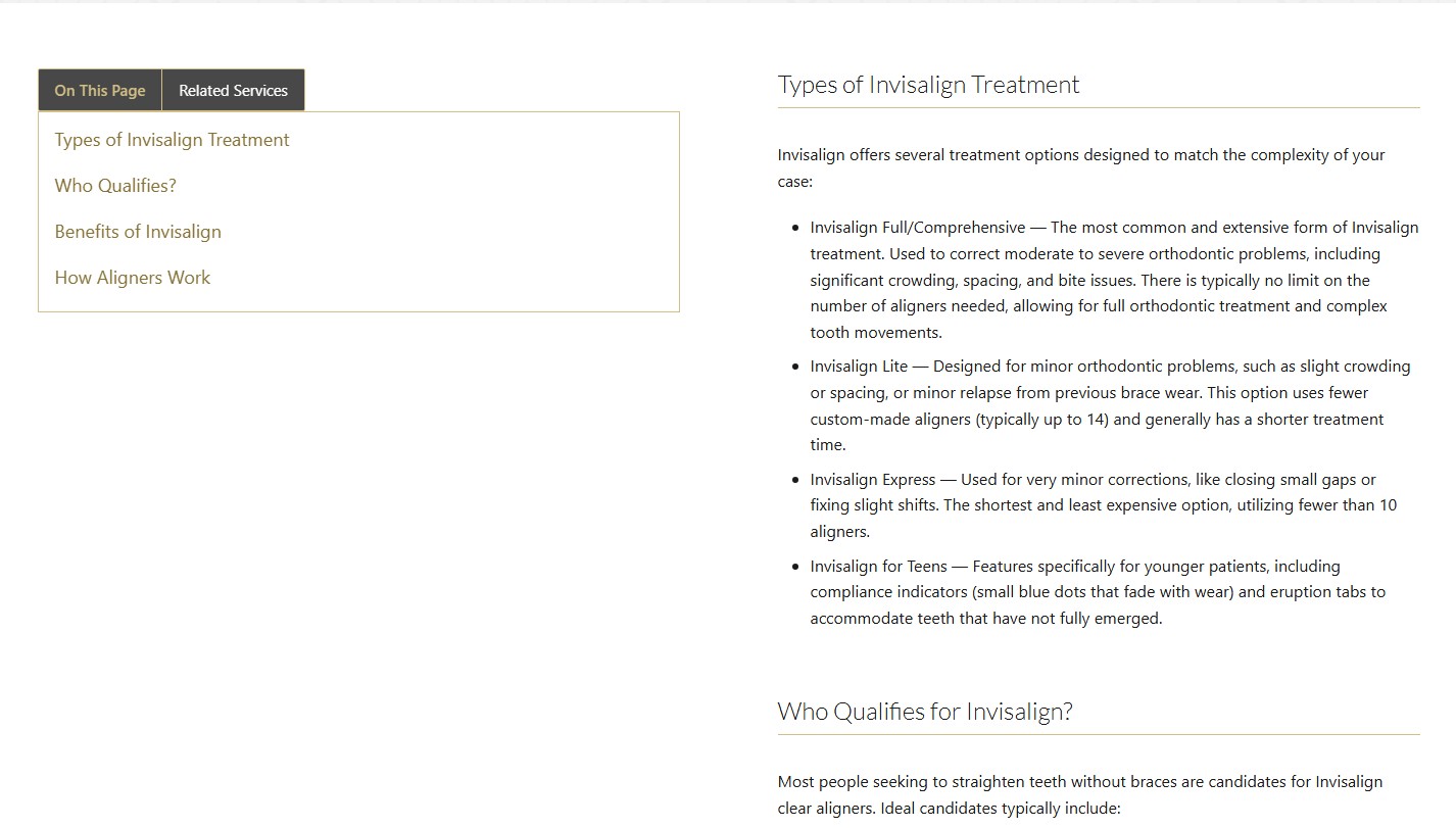
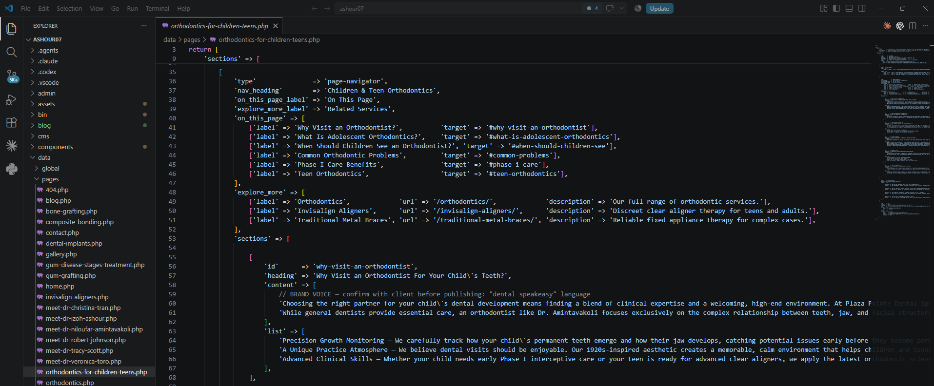
Structured PHP data drives the page navigator, its section links, and related-service routes. The responsive behavior then adapts that local map for long pages where a desktop sticky panel is no longer practical.
04 · In-content interaction
Make treatment detail easier to scan.
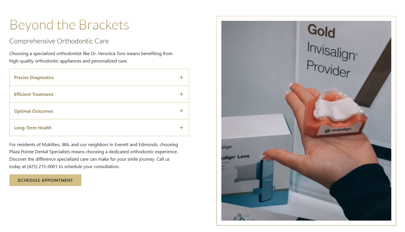
The accordion pattern sits inside editorial service-page compositions, keeping supporting information available without turning the page into an uninterrupted wall of copy.
05 · Branded movement and action
Carry the visual language through place and contact.
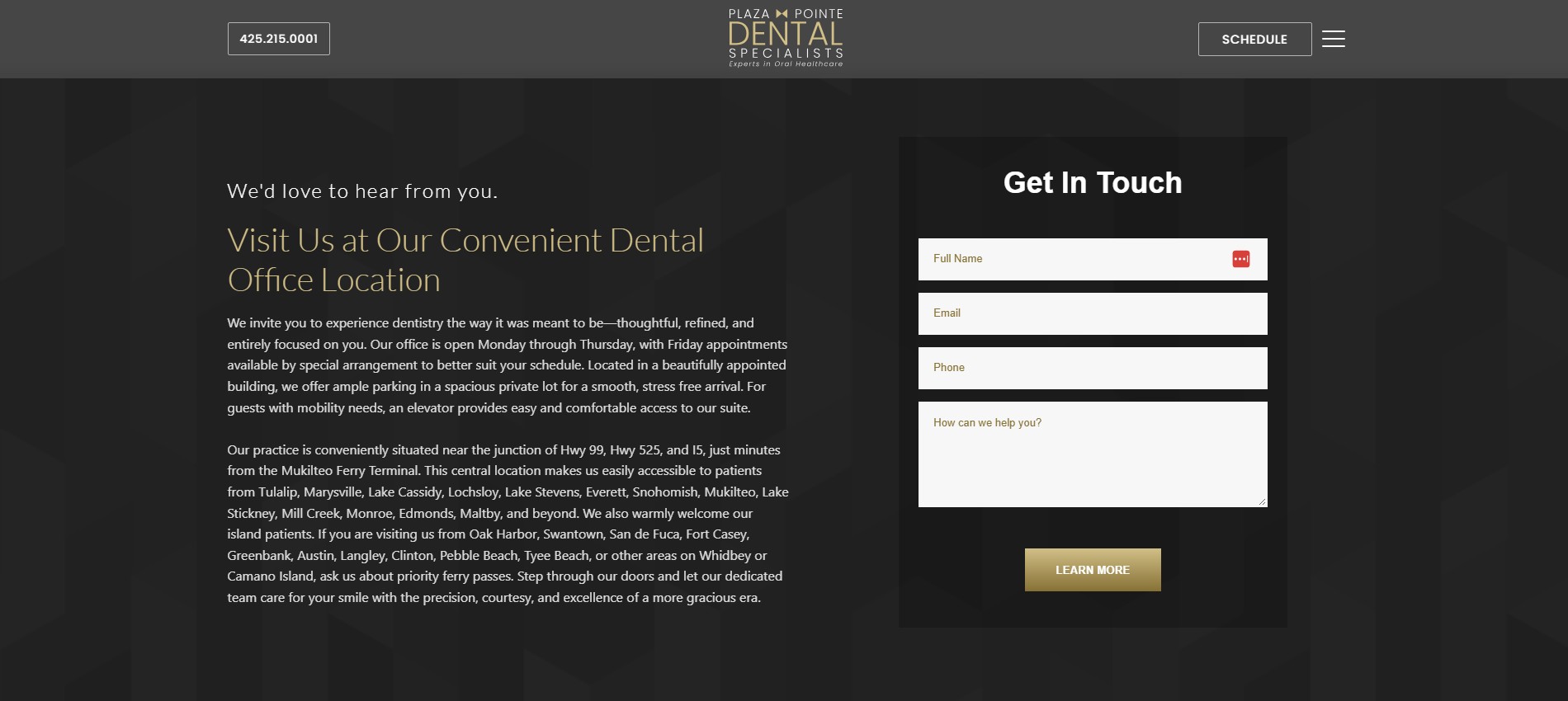
The office slider and closing contact section use different content types while retaining the same dark surfaces, gold accents, image framing, and measured interaction style.
06 · Practical publishing bridge
Keep ongoing articles editable without rebuilding the frontend around WordPress.
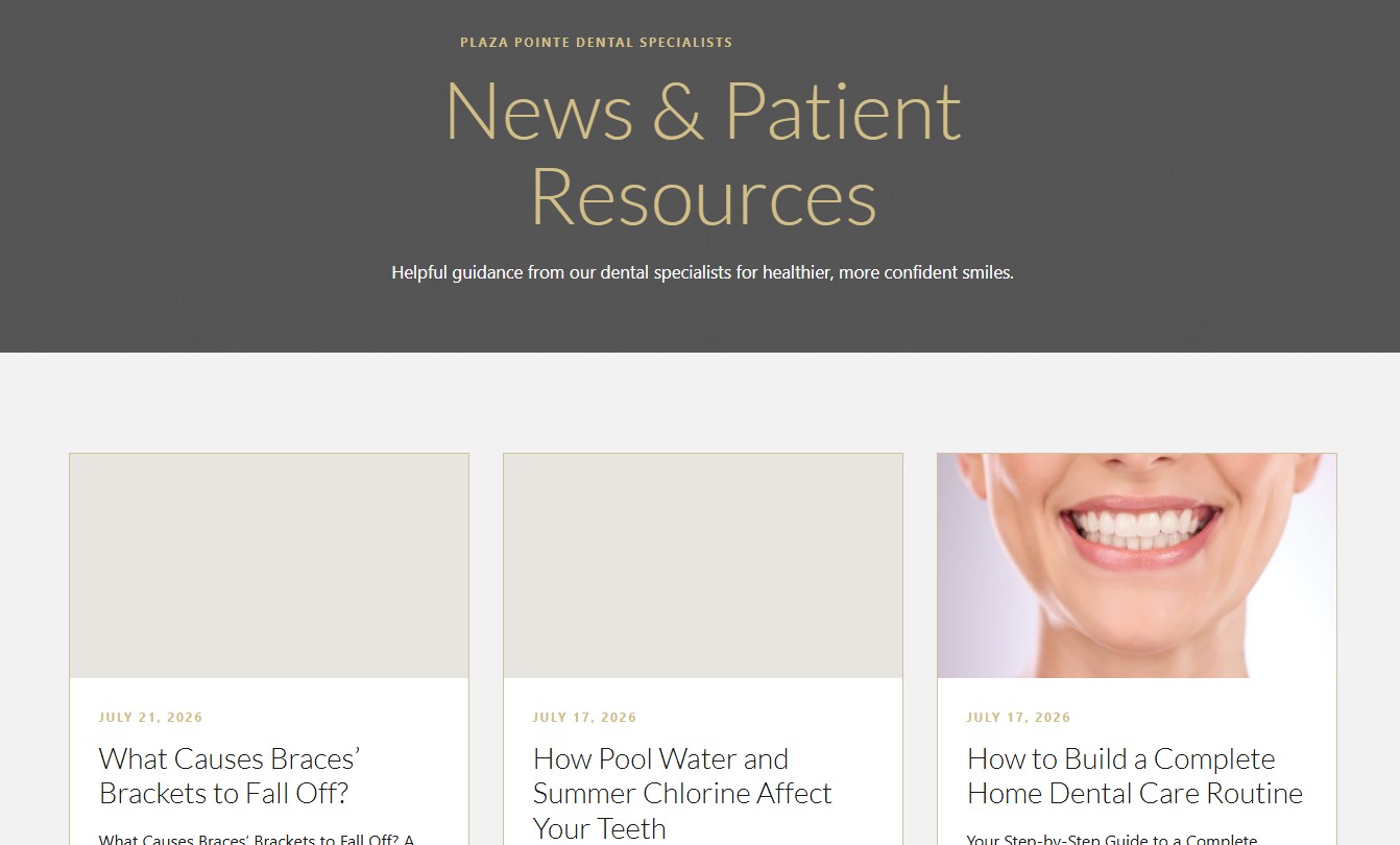
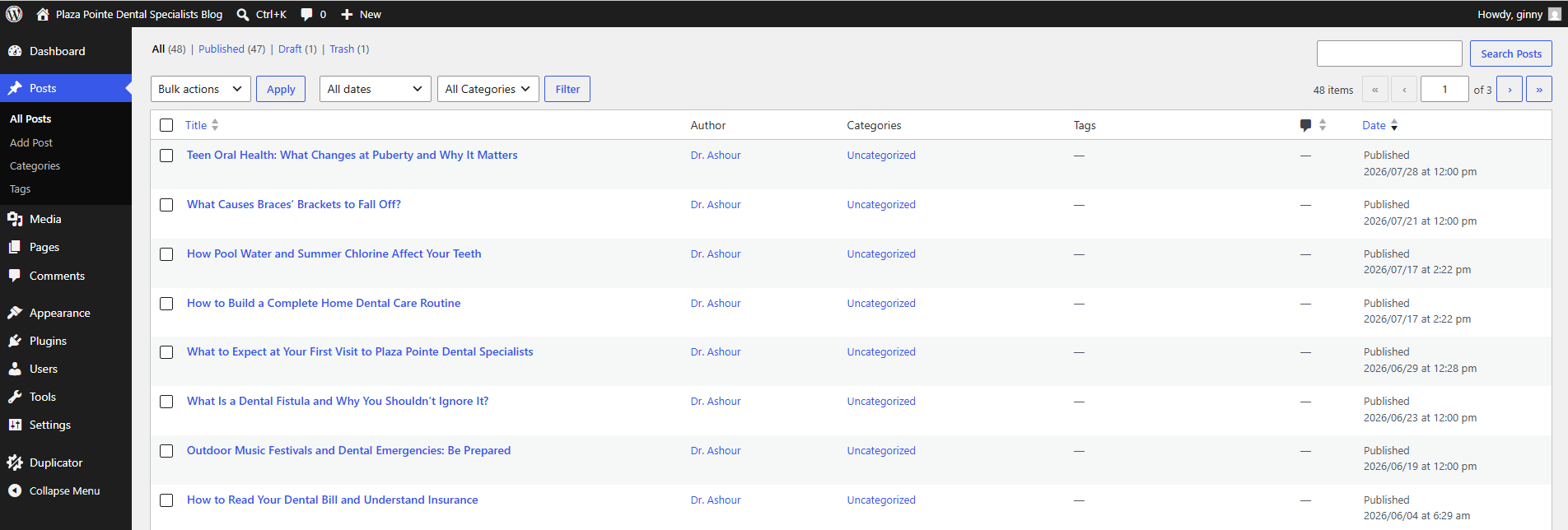
The patient resource index and WordPress post list show the two sides of the article workflow: a branded visitor-facing archive and a familiar publishing surface for ongoing content.