Custom frontend · Cairn
Lake Country Dental
Component-Driven Client Build
Directed a human-led, AI-assisted frontend build using structured PHP data and reusable components across a large real-client website.
01 · Overview
Prove the system on real work.
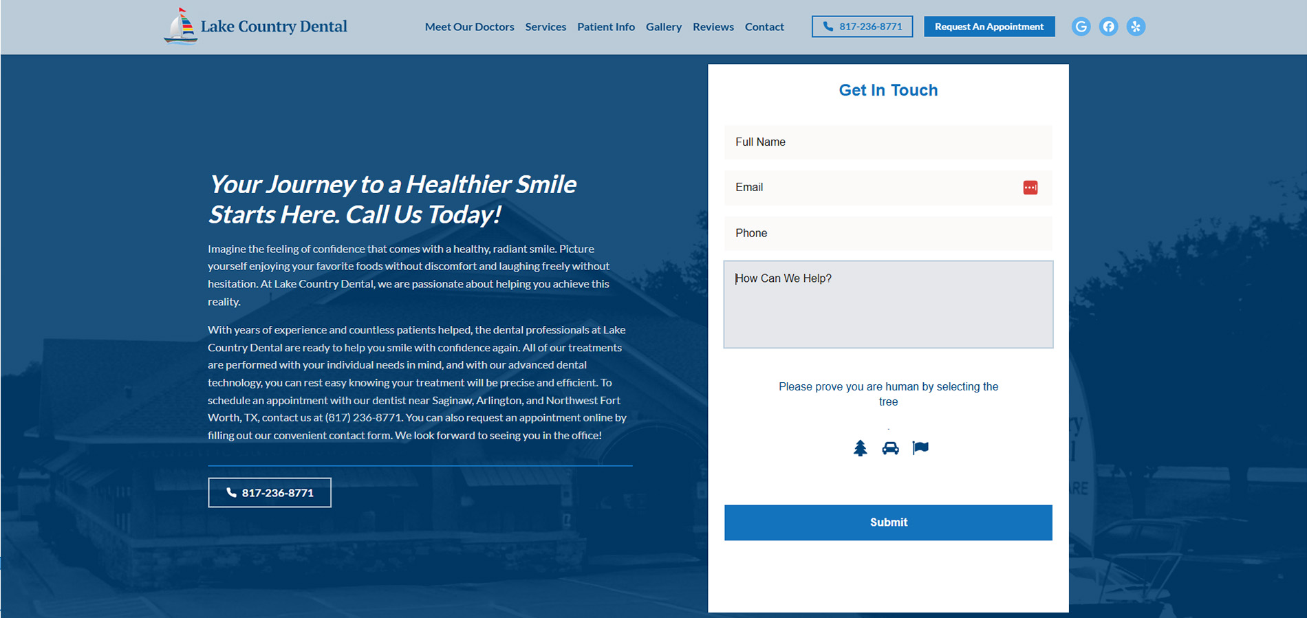
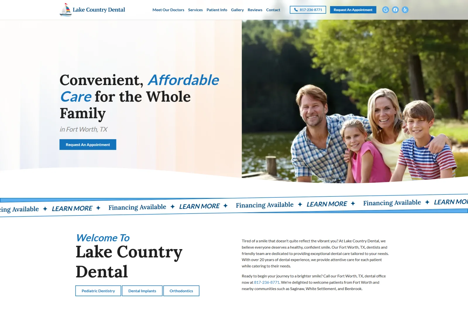
Lake Country Dental was the first large client website built with Cairn, a custom PHP frontend system developed through a human-directed, AI-assisted workflow. The project used structured page data and reusable renderers across 41 approved routes instead of the agency’s usual visual page-builder process.
02 · The challenge
Make a starter survive production.
Cairn had to support real content, nested routes, shared data, responsive components, accessibility requirements, third-party form integration, and launch QA without collapsing into one-off client code. Agent-generated implementation also required careful review for incorrect assumptions, scope drift, inconsistent patterns, and incomplete responsive behavior.
03 · What I built
Direct the system, then test it hard.
I defined component behavior, content structures, visual expectations, responsive rules, and acceptance criteria. Coding agents assisted with implementation, testing, documentation, and repetitive page-data work. I reviewed their output, redlined rendered components, diagnosed routing and integration failures, directed revisions, and determined which improvements belonged in the client build or the reusable Cairn base.
04 · Result
A client site that strengthened the platform.
The finished website demonstrated that Cairn could support a substantial production build with consistent markup, centralized responsive behavior, shared content, and reusable components. Documented accessibility and best-practice audits reached full scores, and lessons from the project directly informed later Cairn architecture and CMS development.
Selected build evidence
The system, under real pressure.
Responsive layouts, reusable interactions, structured content, and moving parts from the production build.
01 · Responsive system
Recompose the experience—not merely shrink it.
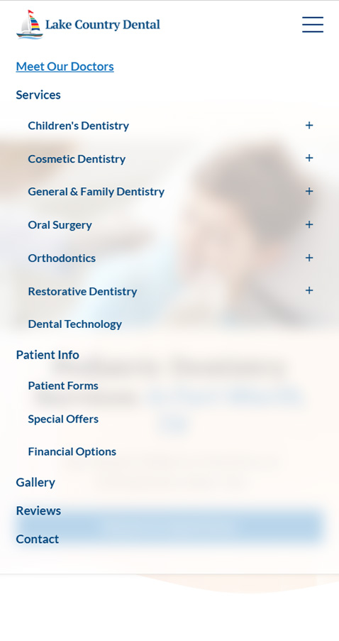
The homepage keeps one visual language across breakpoints while changing hierarchy, image order, navigation, and spacing for the available screen.


02 · Long-page navigation
Give dense service pages a local map.
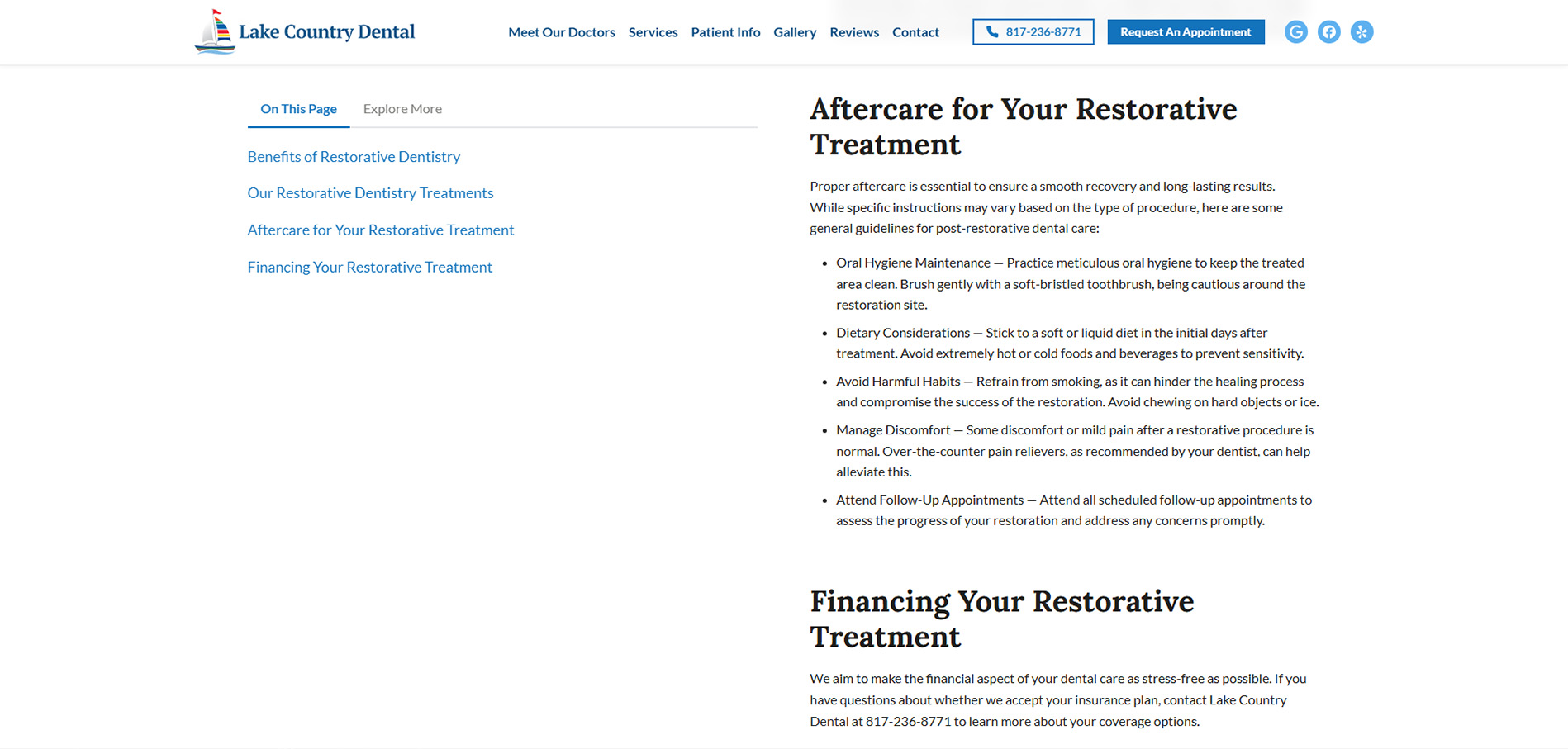
The page navigator turns structured headings into an on-page index and related-content view. Its mobile return behavior keeps that tool useful after the desktop sticky layout is gone.
03 · Cached Google reviews
Keep social proof fast and structurally owned.
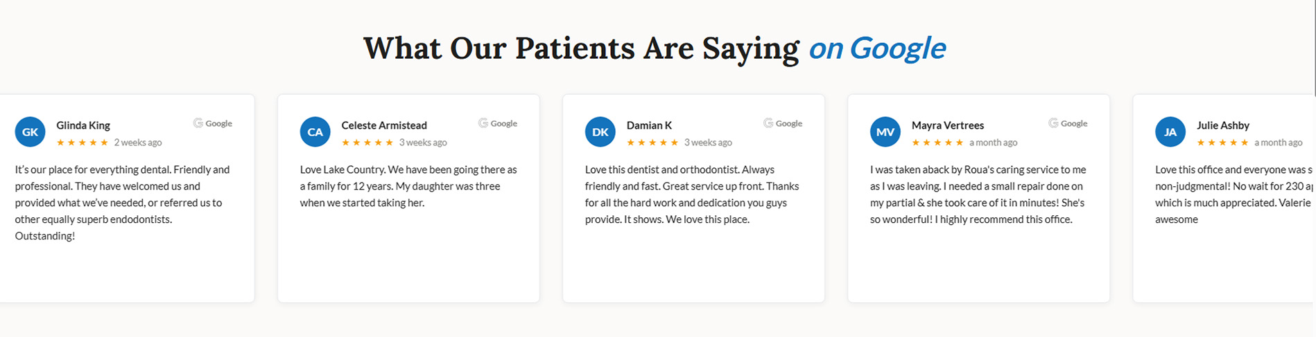
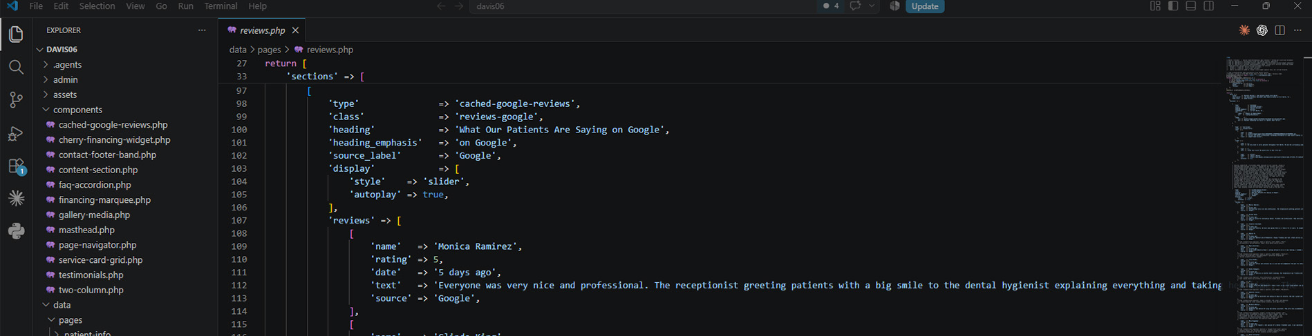
The review display is rendered from structured cached content rather than making public page loads depend on a live third-party request. The paired implementation capture shows the data-driven component contract behind the visible cards.
04 · Reusable interactions
Let one component hold up across breakpoints.
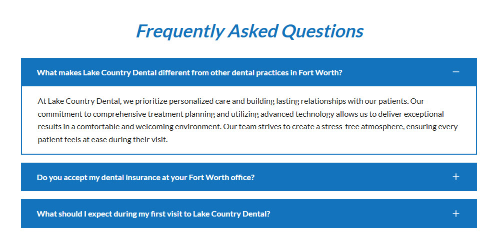
The FAQ uses the same accessible disclosure structure on desktop and mobile, with motion added as progressive feedback rather than as a requirement for understanding the content.
05 · Trust to action
Carry attention from proof to contact.
Motion gives the testimonial system presence without requiring manual input, while the closing CTA gathers context, phone access, and the appointment form into one decisive final section.